Sketchin

A brand to tell the power of Nature

A new identity to show the power of biology-driven products to restore the natural balance in the fields.

A new identity to show the power of biology-driven products to restore the natural balance in the fields.

Industry

Industrial & Manufacture

Year

2017

Client

Bioma

A new conversation with the farmers

Bioma is a Swiss firm that creates products for Agriculture and Zootechnics, in particular fertilisers and pesticides produced without the use of organic chemicals and by applying a biological process instead. The provocative decision to adopt a biology-driven approach represents a paradigm shift, an ethical choice that aims to restore the balance in the soil ecosystem.

Bioma applies its proprietary Geolife® technology to create its products. The brand is already well known in Mexico, where it started, and is now spreading in Europe as well, although it suffers from the fact that the term is quite common.

“A biome /ˈbaɪoʊm/ is a community of plants and animals that have common characteristics for the environment they exist in. They can be found over a range of continents. Biomes are distinct biological communities that have formed in response to a shared physical climate. “Biome” is a broader term than “habitat”; any biome can comprise a variety of habitats.“

The firm has its own salesforce and directly takes care of its sales strategy. Company representatives and consultants promote the products directly to farmers and oenologists, so a consistent and effective communication represents a crucial point in the policy of the company.

Bioma asked us to redesign its brand and communication strategy to improve its capability to spread its values, especially in the zoology and oenology fields.

Visit website
Outcome

Working on the brand didn’t mean to only design a new logo, but also to rethink the entire value proposition and communication strategy of Bioma in order to enhance its products and promote their quality directly to farmers and oenologists.

The result is a new and innovative image with a solid personality, which conveys the company’s core values and increases its competitiveness on the market.

Understanding the brand ecosystem

To better understand the Bioma ecosystem, we researched and developed a detailed system map to identify the relationship between the technology and the products, and a stakeholder map to visualize all the people involved, from the farmers to the final customers.

During the research phase we investigated:

  • The perception of the brand Bioma and the Geolife® technology
  • The experience clients live when using the products and services offered by the company
  • The win and the pain points of their experience
  • The opportunities for enhancement of the communication strategy

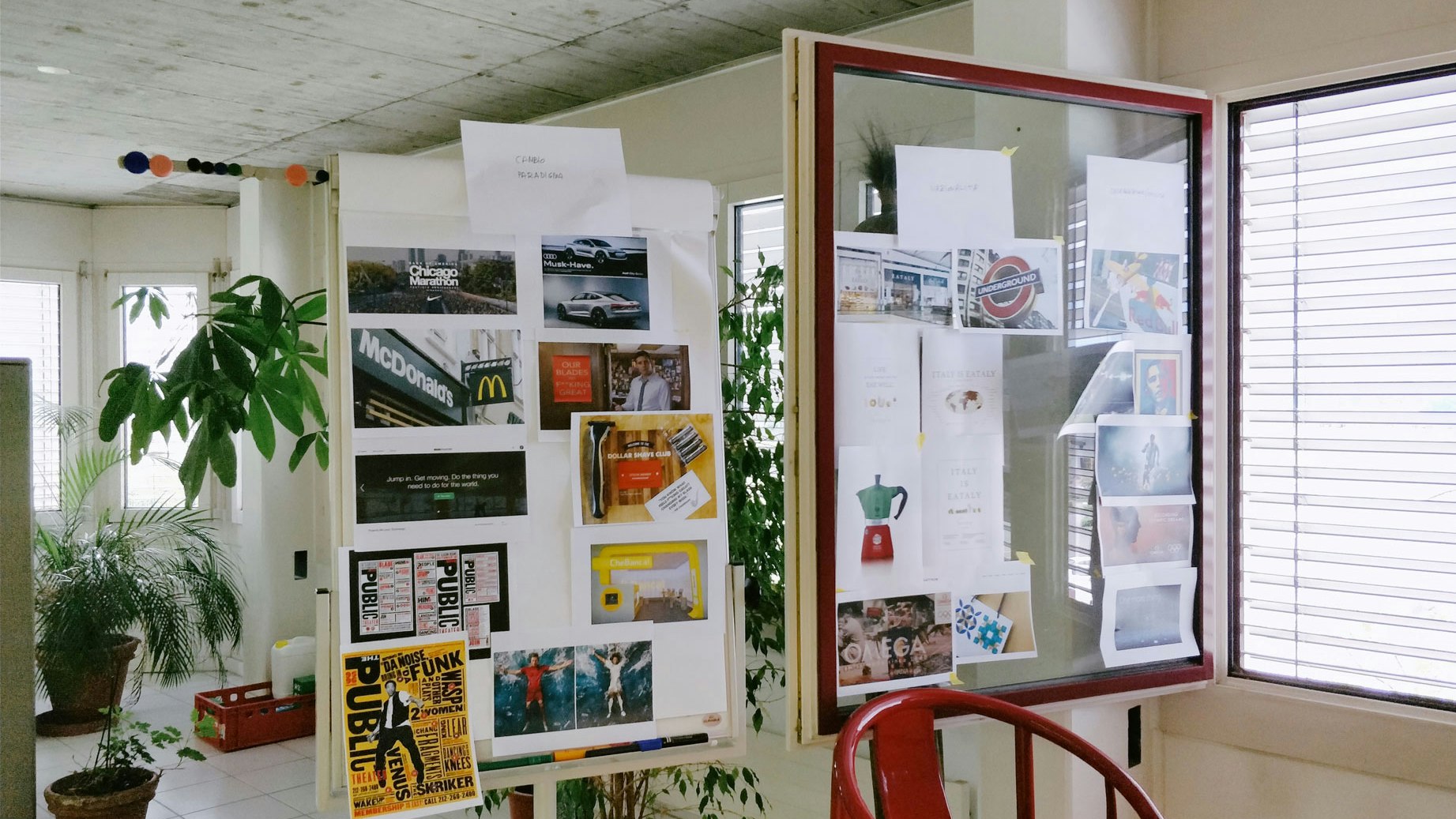
We have thus realised a benchmark of the competitors, identified the core values that need to be communicated, interviewed oenologists and farmers in Europe, and conducted a field research – and we mean in the fields, actually – to observe and understand the use of the products. This allowed us to gain useful insights that helped us address the design phase and build the brand guidelines.

Towards a new communication strategy

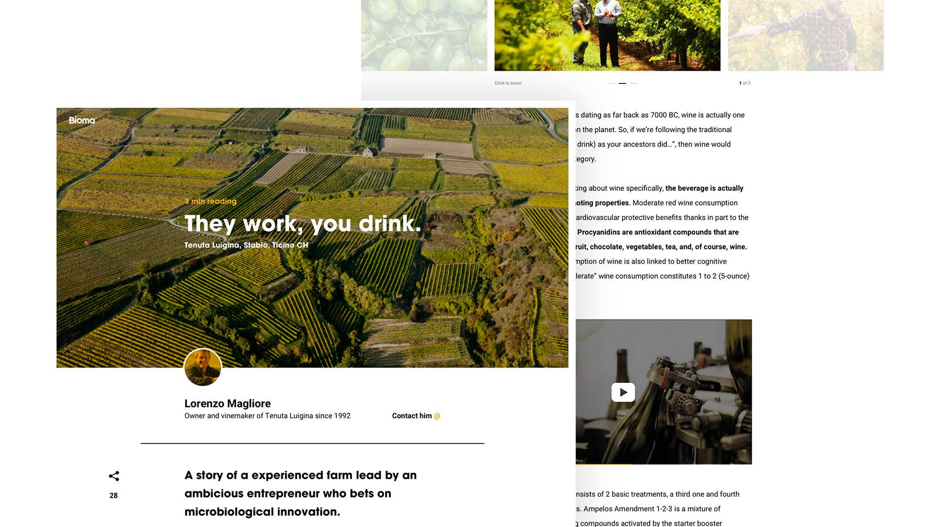
Bioma didn’t have a strong digital presence: its communication strength lay in the personal relationship with the farmers and its presence at the fairs. We have thus studied a communication plan that also covers the digital part.

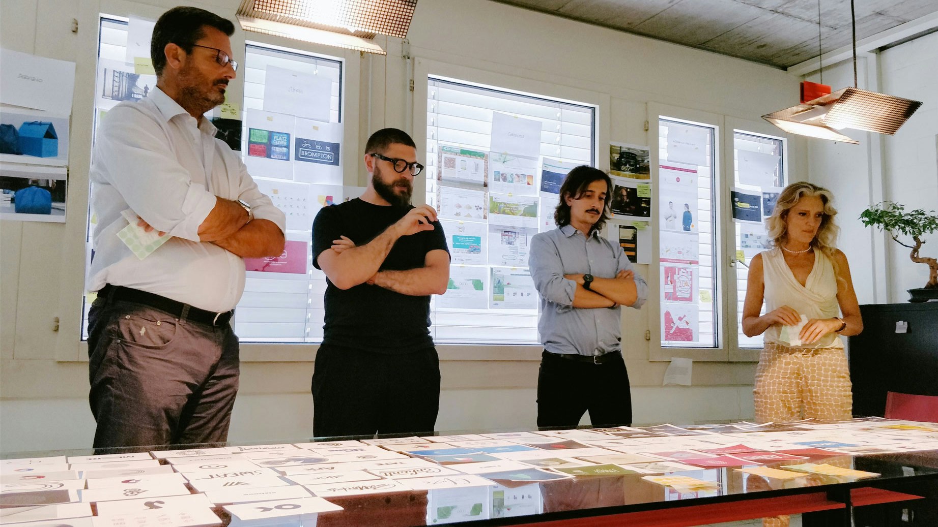
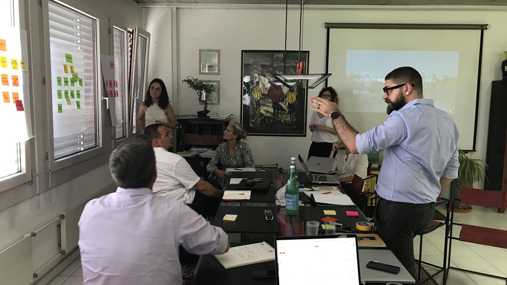
We gathered the stakeholders in a room, strategically guiding them in the synthesis of all their ideas, desires and expectations, in order to build a dialogue within the company and spread a new methodology.

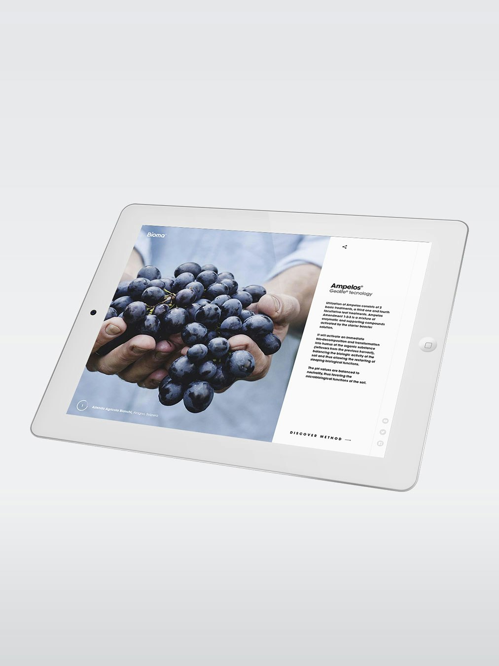
The resulting strategy involved the company website as a place where, together with the information received by the Bioma ambassador, the clients could have further information and form a definite opinion on the products and their biology-driven philosophy.

Connections with the Geolife® technology

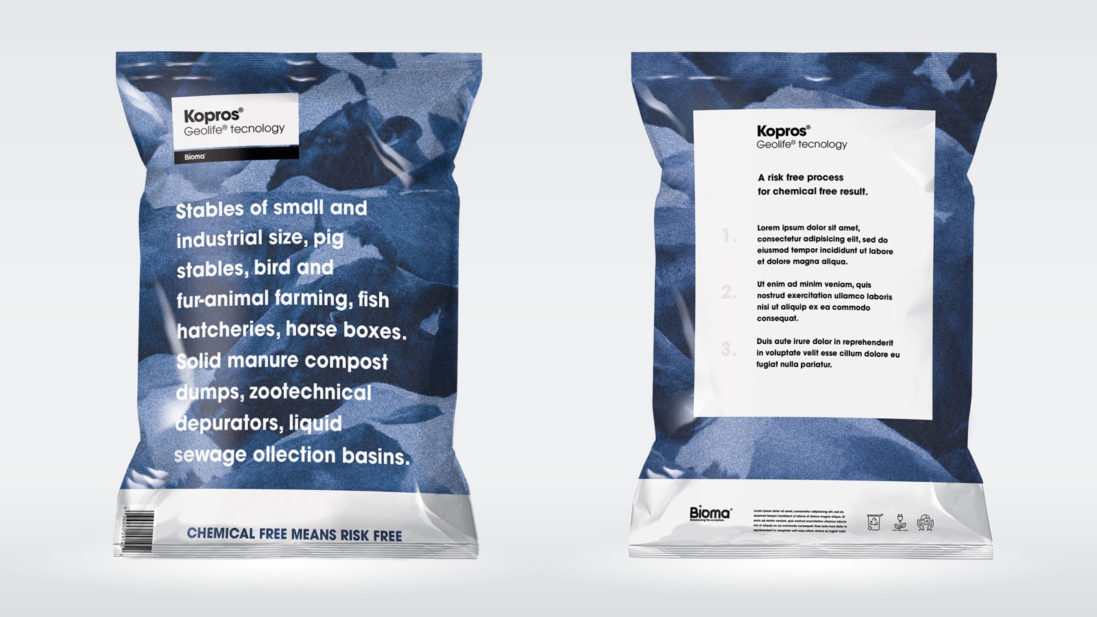
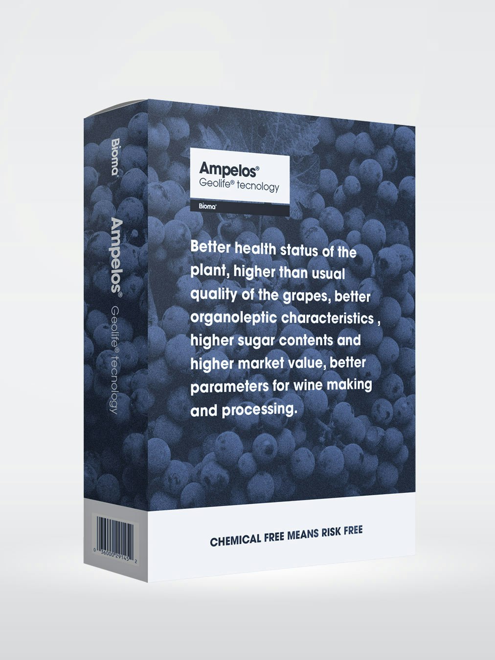
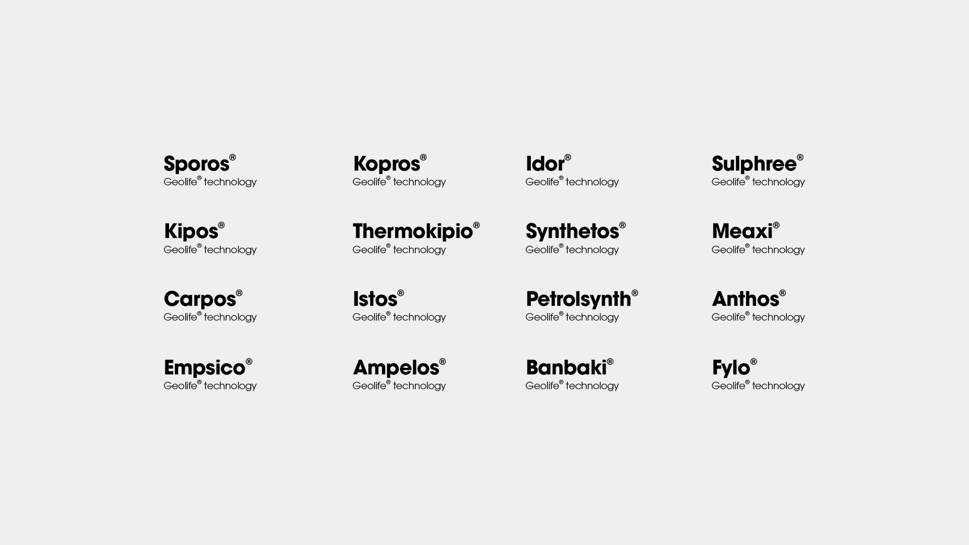
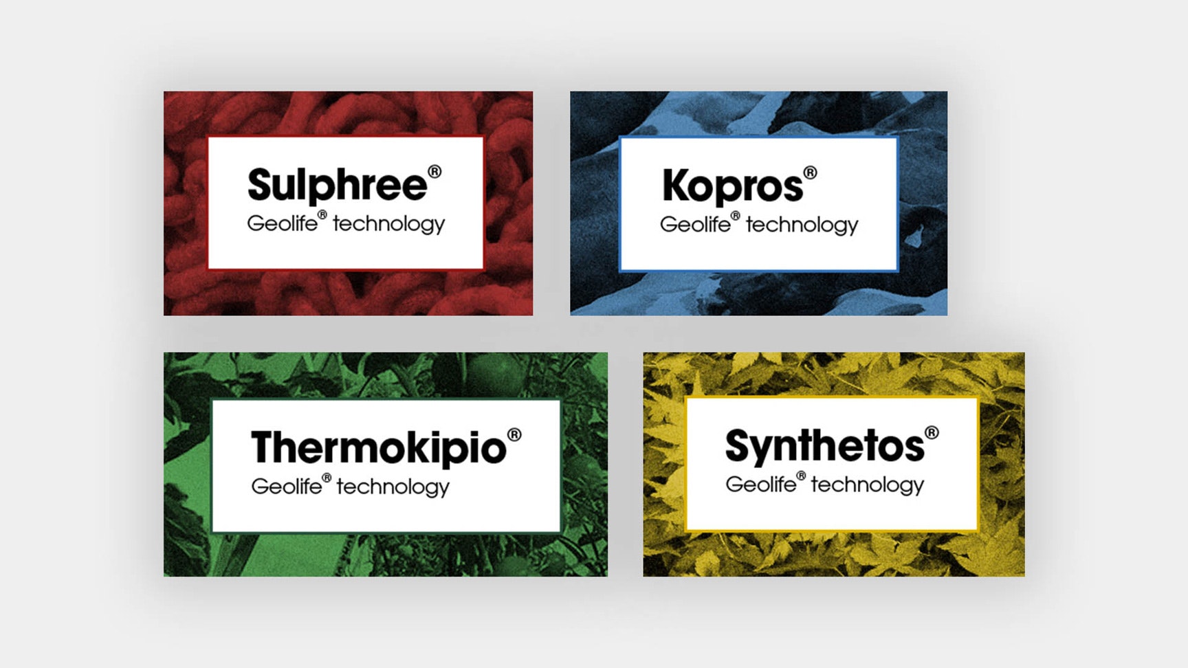
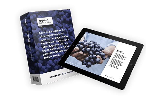
The Geolife® technology is the catalyst for the microbiological processes. The new Bioma identity has been designed to help customers better understand the biology-driven lifestyle and clarify its connection with the technology. A distinctive identity was created for the products in order to enhance their value.

A typography to convey rigour and assurance

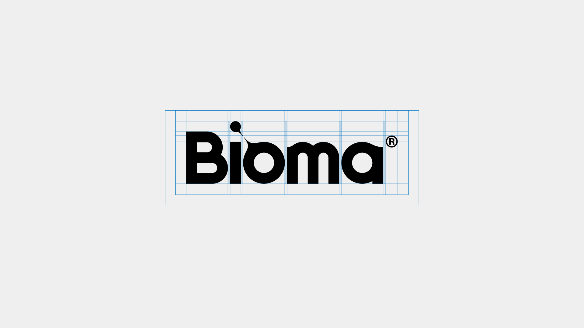
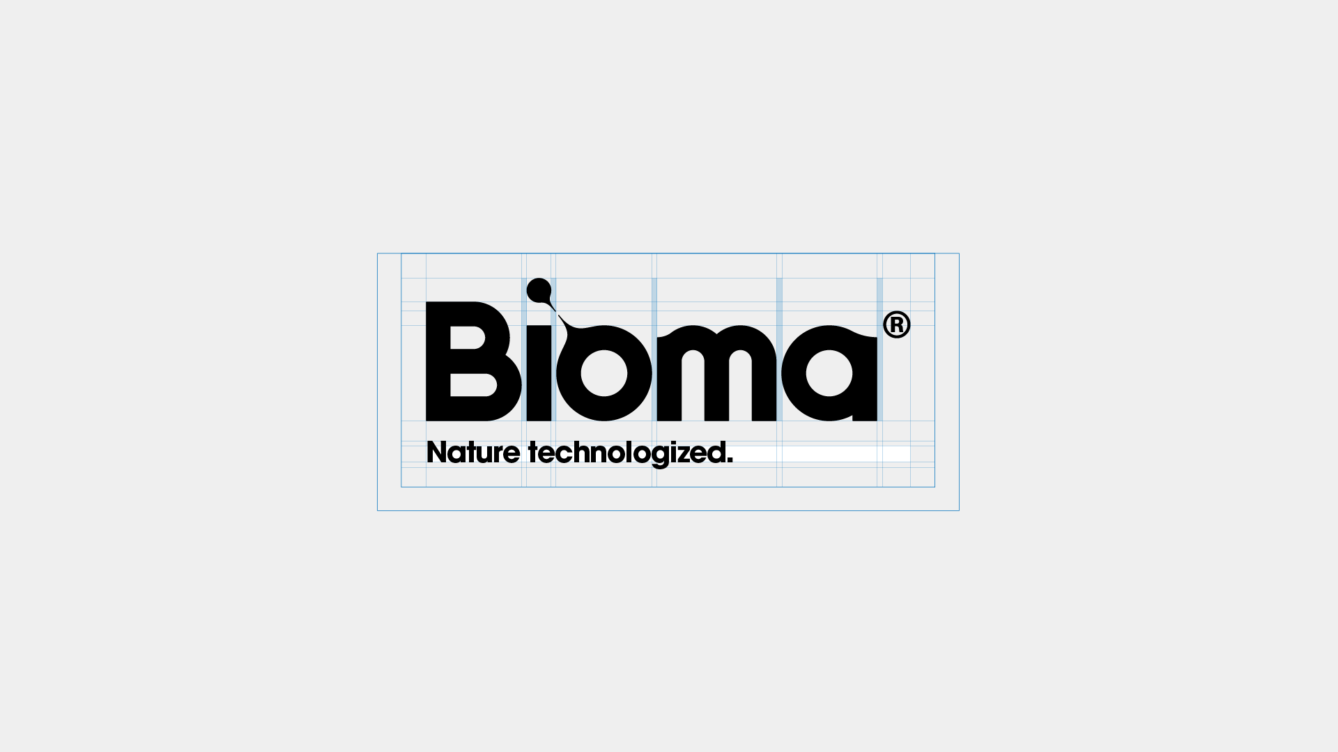
We chose a typography with a strong and solid personality drawn by Lubalin and Carnasse in the ‘70s and recognised as a symbol of innovation ever since. We broke up with the common style used in the chemical industry to underline the paradigm shift represented by Bioma’s biology-driven choice.

The brand, fully integrated with the typography, gives shape to the key concepts and values ​​defined with Bioma through workshops and qualitative research activities.

Redesigning the entire brand has not only simplified the Bioma visual style but also offered the opportunity to deepen the biology-driven philosophy and enhance the value of the individual products, also on a digital level.

Project numbers

designers in the Sketchin team
5
stakeholders involved
Four
communication and brand strategy
One
brand explorations
4
industry experts consulted
Six

Get in touch

Learn more about our projects and what we can do for your business.